Profile Web Component
![]() Deprecated. Web components have been deprecated and replaced with Nitro Impact. While still supported, no updates or fixes are expected for web components.
Deprecated. Web components have been deprecated and replaced with Nitro Impact. While still supported, no updates or fixes are expected for web components.
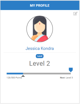
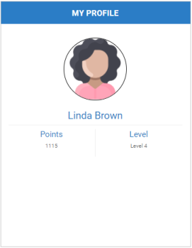
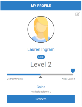
Displays the user's name, role, level, and point balance. You can customize the profile by showing or hiding different elements.
If your program is integrated with the Global Rewards Marketplace, a user's enrollment and verification status determines if they can view their available balance and/or access the Marketplace.
|
|
|
|
|
Level progress bar |
Points balance and no progress bar |
Points balances and access to the Global Rewards Marketplace |
Configure a Web Component
- Open Nitro Studio > Integrate > Web Components.
- Click New > Profile.
- Enter the web component settings.
Parameters are used when working directly with a web component embed tag (HTML) or editing the config.json file for Bunchball Go. - web component - set the component tag as bunchball-profile.
- iframe - must match exactly with the name of the web component created in Nitro Studio.
- web component - Recommended. Web components improve performance due to faster loading. Height and width settings are not required as the web component will fill space on the page like any other HTML element.
- iframe - The source code is a div tag and the rendered web component will be inside an iframe.
- None - Shows the user's lifetime points balance for the point category selected in the Point Category field.
- Current Balance - Shows the user's lifetime and current points balances for the point category selected in the Point Category field.
- Award Balance - Shows the user's lifetime point balance for the point category selected in the Point Category field, the current points balance for the point category tied to your award account, and a Redeem Points button to access the Global Rewards Marketplace.
|
Studio Field |
Description |
Parameters |
||||
|---|---|---|---|---|---|---|
|
Web Component Embed HTML |
Bunchball Go config.json |
Valid Values |
Required (web component) |
Required (iframe) |
||
|
Name |
The web component name. |
name |
name |
|
No |
Yes |
|
Width |
The web component's width. |
width |
width |
relative (%) or absolute value (px) |
No |
Yes |
|
Height |
The web component's height. |
height |
height |
relative (%) or absolute value (px) |
No |
Yes |
|
Custom Styles |
The link to your custom stylesheet(s). Accepts a comma delimited list of URLs. |
|
|
|
|
|
|
Embed Type |
Specifies the type of embed code to generate. |
data-embed-type |
embed-type |
iframe |
No |
Yes |
|
Web Component |
||||||
|
User ID |
The ID of the user to get information for. |
data-user-id |
user-id |
|
Yes |
Yes |
|
Title |
The title to display as the web component's header. Defaults to My Profile. |
data-title |
title |
|
No |
No |
|
Subtitle |
The subtitle to display below the web component header. |
data-subtitle |
subtitle |
|
No |
No |
|
Point Category |
The point category to display. |
data-point-category |
point-category |
|
No |
No |
|
Point Category Title |
The title to display for the user's lifetime points balance. Defaults to the name of the selected point category. |
data-point-category-title |
point-category-title |
|
No |
No |
|
Catalog Navigation |
Defines if the Global Rewards Marketplace catalog should open inline or in a new tab. Defaults to new tab. Most programs, particularly Bunchball Go, will want to set this to new tab. |
data-navigation |
navigation |
inline, new tab |
No |
No |
|
Balance Display Type |
The type of points balance to display in the balance section. |
data-balance-display-type |
balance-display-type |
None, Current, Award Balance |
No |
No |
|
Balance Title |
The title to display when showing the user's current points balance. Defaults to Award Account. |
data-balance-title |
balance-title |
|
No |
No |
|
Award account exclusion group class |
Defines the groups that will not see their award balance or the redemption button. Allows you to hide the award account section for specific groups. |
data-award-account-exclusion-group-class-id |
award-account-exclusion-group-class-id |
|
No |
No |
|
Hide Level Progress Bar |
Specifies if the level progress bar section should be hidden. We recommend hiding this section when using custom levels. |
data-hide-level-progress |
hide-level-progress |
true, false |
No |
No |
|
Max Level Achieved Message |
The message to display in place of the next level when the highest level is reached. By default, the |
data-max-level-achieved-message |
max-level-achieved-message |
|
No |
No |
|
Unenrolled Message |
The message to display when a user is not enrolled in an award account. See Award Account Enrollment and Verification Examples for more details. |
data-unenrolled-message |
unenrolled-message |
|
No |
No |
|
Unverified Message |
The message to display when a user is unverified. Only applies to programs with an award account. |
data-unverified-message |
unverified-message |
|
No |
No |
|
Unverified URL |
The URL you want to use for the unverified button. This can take the user to the location where they can verify their status or link to a browse only version of the catalog. Only applies to programs with an award account. |
data-unverified-url |
unverified-url |
|
No |
No |
|
Editable Items |
Allows users to edit their name and/or image from their profile. These edits update the user's preferences (firstName, lastName, and userPhotoUrl). The web component only supports image uploads in png or jpeg format. Note: If users remove their profile image, it clears the userPhotoUrl preference. |
data-editable-items |
editable-items |
name, image |
No |
No |
|
Language |
Add a language code to preview the web component in a Nitro supported default language. Default languages are: en, de, hi, zh, it, es, and fr. |
|
|
|
No |
No |
|
Custom Language Reference |
Add a language code and then add a custom translation key to the browser console to preview the web component in a non-default language. |
|
|
|
No |
No |
|
|
Marks the root body element inside the web component with a given class(es) name. This makes it easier to style web components sharing the same custom CSS file with theme differences. |
data-theme |
theme |
|
No |
No |
- Click Save & Finish and reopen the web component.
- Click Get Web Component Embed Code. Copy the code to the clipboard or a file.
- Include the code to generate an OAuth token in your app.
- Insert the embed code into the page/div where you want to display the web component in your app or web page, and update the variable for the OAuth token.
Sample Embed Code
See Embed an OAuth Web Component for more information and the Web Components view for the most up-to-date embed code. The following is an example embed for a Profile web component.
|
web component |
iframe |
|---|---|
|
Copy
|
Copy
|
See also


