Styling Web Components
 Deprecated. Web components have been deprecated and replaced with Nitro Impact. While still supported, no updates or fixes are expected for web components.
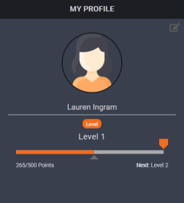
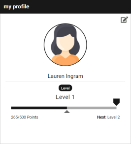
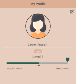
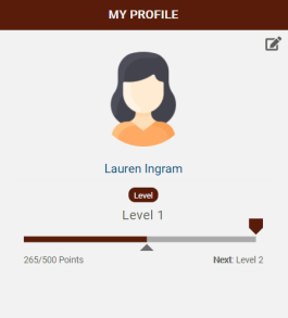
You can use the standard out-of-the-box styling or use HTML and CSS to apply styles that match your program theme. The following examples show different ways you can style the Profile web component using a custom stylesheet.
|
|
|
|
|
|
CSS selectors and classnames are intended to reflect the web component user interfaces. CSS rules cascade down from the most general (styles that apply to all <h1> tags, for example) to the most specific (styles that only apply to <h1> tags inside of a particular div).
The cascade of styles follows this order:
- Core web component styles (included when the web component loads) - Base colors, font sizes, and so on.
- Web component specific styles (included when the web component loads) - Various CSS rules needed for web component-specific layout and display.
- Your custom CSS - Your custom CSS (via Nitro Studio or external CSS files) overrides any of the previous CSS rules, provided that your tags are specific enough.
Custom CSS
Stylesheets are assigned to web components via Nitro Studio with custom overrides via CSS.
Inline CSS
To override styles using a custom inline CSS, add the data-inline-css information, personalized for your environment, to your embed code. Inline CSS is recommended over an external CSS as it eliminates network latency that can occur when pulling in styles from an external stylesheet. Show me example code
For web components, you can also use the data-inline-css-tag which is an ID reference to a style tag on the page. Those styles will be copied into the web component. This helps manage your code when you have a large number of custom styles. Show me example code
External CSS
To override items using a custom external CSS, add the data-custom-css information, personalized for your environment, to your embed code. The url in the data-custom-css parameter must point to the location where your CSS file resides. It must use a secure https link and include both references as noted in this example. Show me example code
Common Style Overrides
The CSS file only needs to contain items that you want to override. Show me a sample stylesheet using these overrides.
|
Web Component |
Element to Change |
CSS Override |
|---|---|---|
|
All web components |
Header background |
.widget-header-title {background-color: #xxxxxx} Preface with .nitro-WebComponentName-widget to change the color for one web component only.
|
|
Header text |
.widget-header-title h3 {color: #xxxxxx; text-transform: transformType} Preface with .nitro-WebComponentName-widget to change the color for one web component only. See Header background for web component names. |
|
|
Text |
h1, h2, h3, h4, h5, h6, .cell, a, span, p, b {color: #xxxxxx;} |
|
|
Subheader background and text |
.widget-subheader {background-color: #xxxxxx; color: #xxxxxx;} |
|
|
Background (all web components) |
.nitro-widget {background-color: #xxxxxx;} |
|
|
Page animation background |
.page-animation {background-color: #xxxxxx} |
|
|
Grid background (leaderboards, events, recognitions) |
.grid-x {background-color: #xxxxxx;} .grid-y {background-color: #xxxxxx;} |
|
|
Button hover background |
.button, .button:hover {background-color: #xxxxxx;} |
|
|
Scroll areas |
.scroll-area {background-color: #xxxxxx} |
|
|
Events web component |
Background (Events web component only) |
.nitro-events-widget .events {background-color: #xxxxxx;} |
|
Text indicating when the activity occurred (for example, "a day ago") |
.nitro-events-widget .events .text-right {color: #xxxxxx;} |
|
|
Leaders web component |
Background of leaderboard grid (Leaders web component only) |
.leaderboard-content-container {background-color: #xxxxxx;} |
|
Background and border of user profile section |
.leaderboard-profile-section {border-top: 1px solid #xxxxxx; background: #xxxxxx;} |
|
|
User's name and "Your Value" text in profile section |
.leaderboard-profile-section h3, .leaderboard-profile-section h4 {margin: 0; color: #xxxxx;} |
|
|
Numbers indicating the user's rank on the leaderboard |
.text-center {color: #xxxxxx;} |
|
|
Drop-down menu background and text (when the web component contains multiple leaderboards) |
.hook-selector select {background-color: #xxxxxx; border: 1px solid #xxxxxx; color: #xxxxxx} |
|
|
Missions web component |
Background (Missions web component only) |
.challenges-next-main, .nitro-widget {background-color: #xxxxxx} .tabs {background: none;} |
|
Background of elements when information is loading |
@-webkit-keyframes loadingPlaceholders { 0% {background-color: transparent;} 50% {background-color: transparent; } 100% {background-color: transparent;}} @keyframes loadingPlaceholders { 0% {background-color: transparent;} 50% {background-color: transparent;} 100% {background-color: transparent;}} |
|
|
Active tab title text |
.tabs .tab-titles a.title.active {color: #xxxxxx;} Note: In some cases, other overrides may be required to change the text color. Show me |
|
|
Icons for locked, opening soon, and number of completions (hourglass, lock, grid) |
.icon-small {color: #xxxxxx} |
|
|
Arrow for linked tasks and mission URL |
.external-link-icon, .internal-link-icon {color: #xxxxxx} |
|
|
Text for mission start times and level requirements (for example, "Must be at Level 3") |
.highlighted-text {color: #xxxxxx} |
|
|
List view - Background of generated text for locked missions (for example, "Must be at Level 3") |
.challenge-urgency-text {background-color: #xxxxxx} |
|
|
List view - Filter buttons background, border, and text |
.filters .filter {border:1px solid #xxxxxx; background-color: #xxxxxx; color: #xxxxxx} |
|
|
List view - Active filter button background and text |
.filters .active {background-color: #xxxxxx; color: #xxxxxx} |
|
|
List view - Hide the filter button |
#filter-dropdown {display: none;} |
|
|
List view - Filter button hover background and text |
.filters .button:hover {background-color: #xxxxxx; color: #xxxxxx} |
|
|
List view - Mission name text |
.challenge-card .card-title {color: #xxxxxx;} |
|
|
List view - Number of points text |
.points-text .points {color: #xxxxxx} |
|
|
List view - Mission container border |
.card {-webkit-box-shadow: 0 0 5px #xxxxxx;} .loading-card {-webkit-box-shadow: 0 0 0px #xxxxxx;} |
|
|
List view - Change the icon radius from circular to square |
.circular-portrait {border-radius: 0} |
|
|
Detail view - Background of tasks list |
.grid-x>.small-1, .grid-x>.small-2, .grid-x>.small-3, .grid-x>.small-4, .grid-x>.small-5, .grid-x>.small-6, .grid-x>.small-7, .grid-x>.small-8, .grid-x>.small-9, .grid-x>.small-10, .grid-x>.small-11, .grid-x>.small-12 {background-color: #xxxxxx} |
|
|
Detail view - Progress indicator fill color |
.challenge-description-icon svg path {stroke: #xxxxxx;} |
|
|
Detail view - Mission description text |
.text-medium-light {color: #xxxxxx;} |
|
|
Detail view - "Mission is locked" text |
.text-small.pt10 {color: #xxxxxx;} |
|
|
Detail view - "Rewards you can earn" and "Complete the following" text |
.text-emphasis {color: #xxxxxx;} |
|
|
Detail view - Tasks circle color |
.tasks-section .tasks .task .task-progress {color: #xxxxxx;} |
|
|
Detail view - Task completion text (for example, 0 of 25 completed) |
.text-small {color: #xxxxxx;} |
|
|
Detail view - Rewards formatting |
.rewards-section .rewards-tray .reward-circle {box-shadow: none} .rewards-section .rewards-tray .reward-circle {font-size: xxpx; color: #xxxxxx;} |
|
|
Detail view - Self-reporting rule buttons |
.slide-up-overlay #container button {border-radius: 20px; padding-left: 20px; padding-right: 20px; border: 1px solid #xxxxxx; outline: 0;} .button.hollow {color: #xxxxxx} .slide-up-overlay #container button.self-reporting-confirmation-button {background-color: #000000;} .slide-up-overlay #container button {border-radius: 20px; padding-left: 20px; padding-right: 20px; border: 1px solid #xxxxxx; outline: 0;} |
|
|
Filters menu - Background and text |
#labels-container {background-color: #xxxxxx;} #labels-container .label-stack .label-item {background-color: #xxxxxx;} #labels-container .label-stack .label-item label {color: #xxxxxx; padding: 1px 1px 1px 0;} |
|
|
Filters menu - Position the menu at the top of the overlay and increase its height |
#labels-overlay {position: relative} #labels-container {height: 90% !important;} |
|
|
Filters menu - Close button border and text |
#labels-container button {border: 1px solid #xxxxxx; color: #xxxxxx} |
|
|
Filters menu - "Filters" text |
.text-section-title {color: #xxxxxx} |
|
|
OTS web component |
Background (OTS web component only) |
.nitro-widget .ots-main {background-color: #xxxxxx} |
|
Redeem button background and text |
.button {background-color: #xxxxxx; color: #xxxxxx} |
|
|
Redeem button hover background and text |
.button:hover {background-color: #xxxxxx; color: #xxxxxx} |
|
|
Code input field background and border |
.ots-mask-card-number {background-color: #xxxxxx; border: 1px solid #xxxxxx;} |
|
|
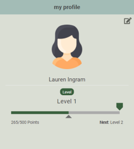
Profile web component
|
Background (Profile web component only) |
.nitro-profile-widget .profile {background-color: #xxxxxx} |
|
Background of Edit button section |
.nitro-widget {background-color: #xxxxxx} |
|
|
User name text |
#name {color: #xxxxxx} |
|
|
Role text |
#role-elements p {color: #xxxxxx} |
|
|
Level label background and text |
h6.label {background-color: #xxxxxx; color: #xxxxxx} |
|
|
Level text |
#level-section #user-level-lable {color: #xxxxxx;} |
|
|
Progress indicator |
#level-section .level-progress-bar svg #destination-waypoint {fill: #xxxxxx;} |
|
|
Destination indicator |
#level-section .level-progress-bar svg #progress-value {stroke: #xxxxxx;} #level-section .level-progress-bar svg #progress-waypoint {fill: #xxxxxx;} |
|
|
Remove border around user image |
.crop-image {border:none !important;} |
|
|
Hide the disabled Award Account redeem button |
#redeem-btn[disabled] {display: none;} |
|
|
Award Account redeem button |
.button {background-color: #xxxxxx; color: #xxxxxx} |
|
|
Award Account current balance category name |
#balance span::after {content: " Name"} |
|
|
Quiz web component
|
Get Started button |
span.button.large {background-color: #xxxxxx; color: #xxxxxx} |
|
Background and border of quiz questions |
.quiz-content-body {background-color: #xxxxxx; border: 1px solid #xxxxxx} |
|
|
Submit button |
.button.large {background-color: #xxxxxx; color: #xxxxxx;} |
|
|
Submit button hover and disabled |
.submitBtn .button, .button.disabled:focus, .button.disabled:hover, .button[disabled]:focus, .button[disabled]:hover {background-color: #xxxxxx; color: #xxxxxx;} |
|
|
Question text |
.quiz-question-multiple-choice-question {color: #xxxxxx;} |
|
|
Spacing between quiz answers |
.quiz-content-body .not-selected {height: xxpx !important;} .quiz-content-body li span {height: xxpx !important;} Note: Adjusting the height to 30px halves the default spacing. |
|
|
Background of selected answer |
.quiz-question-multiple-choice-answers li {background-color: #xxxxxx;} |
|
|
Background of selected answer hover |
.quiz-question-multiple-choice-answers li:hover {background-color: #xxxxxx;} |
|
|
Display an image with list items |
.quiz-question-multiple-choice-answers ul li.not-selected {background-image: url(url to image); background-repeat: no-repeat; background-size: xxpx xxpx; background-position: left; background-color: #xxxxxx;} .quiz-question-multiple-choice-answers ul li.not-selected:hover {background-image: url(url to image); background-repeat: no-repeat; background-size: xxpx xxpx; background-position: left; background-color: #xxxxxx;} .quiz-question-multiple-choice-answers ul li.not-selected:active {background-image: url(url to image); background-repeat: no-repeat; background-size: xxpx xxpx; background-position: left; background-color: #xxxxxx;} .quiz-question-multiple-choice-answers ul li {background-image: url(url to image); background-repeat: no-repeat; background-size: xxpx xxpx; background-position: left; background-color: #xxxxxx;} .quiz-question-multiple-choice-answers ul li:hover {background-image: url(url to image); background-repeat: no-repeat; background-size: xxpx xxpx; background-position: left; background-color: #xxxxxx;} .quiz-question-multiple-choice-answers ul li:active {background-image: url(url to image); background-repeat: no-repeat; background-size: xxpx xxpx; background-position: left; background-color: #xxxxxx;} |
|
|
Stats section - hide the background and text |
.quiz-question-stats {display: none;} |
|
|
Stats section - background and text ( for example, "Question 2/3") |
.quiz-question-stats {background-color: #xxxxxx;} .quiz-question-stat p {color: #xxxxxx} .quiz-question-stat h4 {color: #xxxxxx} |
|
|
Stats section - Background of correct answer |
.quiz-question-stats.correct-answer {background: #xxxxxx;} |
|
|
Stats section - Background of incorrect answer |
.quiz-question-stats.correct-answer {background: #xxxxxx;} |
|
|
Suppress the pass/fail sections of a quiz. You can condition this on quiz ID (as shown here) if you have a combination of quizzes where you want to show pass/fail information and others where you want to hide it. Typically this override will be used if you have a survey that requires a pass/fail result. Quizzes record pass/fail information in Nitro while surveys always send the result as Passed. |
#quiz-460 .quiz-question-stat {display: none; visibility: hidden;} #quiz-460 .quiz-question-stats {background-color: #ffffff;} #quiz-460 .quiz-question-stats.incorrect-answer {background: rgba(43, 125, 198, 0.1);} #quiz-460 .quiz-question-stats.incorrect-answer:after {display: block; content: "Thank you for your response."; text-align: center; font-size: 1.95312rem;} #quiz-460 .not-selected i {display: none; visibility: hidden;} #quiz-460 .fa-times::before {content: "\f00c"; color: #69b04c;} #quiz-460.quiz-complete .quiz-question-stats div h4 {display: none; visibility: none;} #quiz-460.quiz-complete .quiz-question-stats > div:first-child:before {display: block; content: "This text displays on the first row of the survey completion page.";} #quiz-460.quiz-complete .quiz-question-stats > div p {visibility: hidden;} #quiz-460.quiz-complete .quiz-question-stats > div:first-child:after {display: block; content: "This is the second row of the survey's completion page."; margin-bottom: 2%;} #quiz-460.quiz-complete .button {font-size: 0;} #quiz-460.quiz-complete .button:after {content: "Next"; font-size: medium; display: block; padding: 0.85em;} #quiz-460.quiz-complete .button .fa {display: none; visibility: hidden;} |
|
|
Recognitions web component |
Form view - Field background and text (comment, points, and balance) |
.interaction-widget input {background-color: #xxxxxx; color: #xxxxxx;} |
|
Form view - Search field background |
.Select-control {background-color: #xxxxxx;} |
|
|
Form view - "New Recognition" and "Back" hover |
a.link:hover {color: #xxxxxx} |
|
|
Form view - "Why do you want to recognize them" field background |
select {background-color: #xxxxxx;} |
|
|
Form view - Submit button |
.button.large {background-color: #xxxxxx;} |
|
|
Trophy Case web component |
List view - Background web component only |
.nitro-trophy-widget {background-color: #xxxxxx;} .nitro-trophy-widget .trophy-container {background-color: #xxxxxx;} |
|
List view - "Earned" heading text |
.nitro-trophy-widget .latest-trophy figure figcaption .latest-earned {color: #xxxxxx;} |
|
|
List view - Mission name and date earned text |
.nitro-trophy-widget button figcaption {color: #xxxxxx} |
|
|
List view - Hide the scroll bar until needed |
.nitro-trophy-widget .all-trophies {overflow-y: auto;} |
|
|
Detail view - background and border |
.nitro-trophy-widget .trophy-detail {background-color: #xxxxxx; border: 2px solid #xxxxxx;} |
|
|
Detail view - Heading text (Description, Last Date Earned, Times Earned) |
dd {color: #xxxxxx;} |
|
|
Detail view - Information text (mission description, date earned, number of times earned) |
.nitro-trophy-widget .trophy-detail .trophy-content dt {color: #xxxxxx;} |
|
|
Bunchball Go |
Footer background |
.footer {background-color: #xxxxxx;} |
|
Footer inactive icons |
.footer .footer-link i.fa, .footer .footer-link svg, .footer .footer-link svg path {color: #xxxxxx;} |
|
|
Footer active icon |
.footer .footer-link i.fa.active, .footer .footer-link svg.active, .footer .footer-link svg.active path {color: #xxxxxx;} |
|
|
Hub background |
body {background-color: #xxxxxx} |
|
|
Home page background |
#page-home {background-color: #xxxxxx} |
|
|
Header background |
header.header {background-color: #xxxxxx;} |
|
|
Section background |
.section {background-color: #xxxxxx} |
See also