Leaders Web Component
 Deprecated. Web components have been deprecated and replaced with Nitro Impact. While still supported, no updates or fixes are expected for web components.
Displays a leaderboard of user or group actions, missions, or points. You can configure the web component to show one or multiple leaderboards.
|
|
|
|
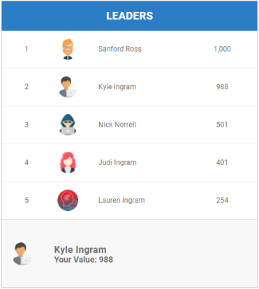
One leaderboard with profile |
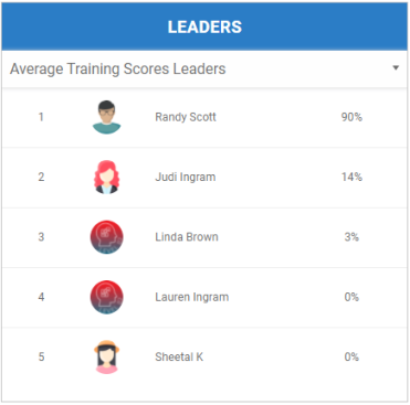
Multiple leaderboards with no profile |
Configure a Web Component
- Create a leaderboard in the Leaderboards view or using the /leaderboards APIs.
- (Optional) To show an image in a group or aggregate leaderboard, add a group image.
- (Optional) To set the leaderboard to display only the first initial of the user's last name, set the displayLeadersLastInitial site preference to true.
- Open Nitro Studio > Integrate > Web Components.
- Click New > Leaders.
- Enter the web component settings.
Parameters are used when working directly with a web component embed tag (HTML) or editing the config.json file for Bunchball Go. - web component - set the component tag as bunchball-leaders.
- iframe - must match exactly with the name of the web component created in Nitro Studio.
- web component - Recommended. Web components improve performance due to faster loading. Height and width settings are not required as the web component will fill space on the page like any other HTML element.
- iframe - The source code is a div tag and the rendered web component will be inside an iframe.
- count - Returns leaders with the most number of actions logged.
- sum - Returns leaders with the highest cumulative action values logged.
- min - Returns leaders with the lowest action value logged. Shows leaders in ascending order.
- max - Returns leaders with the highest action value logged.
- average - Returns leaders with the highest average of the action values logged.
- lifetimeBalance - Returns leaders with the highest balance after calculating point credits plus debits.
- creditBalance - Returns leaders who have the most point credits.
- debitBalance - Returns leaders who have the most point debits.
- completionCount - Returns leaders who have the most number of missions completed.
|
Studio Field |
Description |
Parameters |
|||||
|---|---|---|---|---|---|---|---|
|
Web Component Embed HTML |
Bunchball Go config.json |
Valid Values |
Required (web component) |
Required (iframe) |
|||
|
Name |
The web component name. |
name |
name |
|
No |
Yes |
|
|
Width |
The web component's width. |
width |
width |
|
No |
Yes |
|
|
Height |
The web component's height. |
height |
height |
|
No |
Yes |
|
|
Custom Styles |
The link to your custom stylesheet(s). Accepts a comma delimited list of URLs. |
|
|
|
No |
No |
|
|
Embed Type |
Specifies the type of embed code to generate. |
data-embed-type |
embed-type |
iframe |
No |
Yes |
|
|
Basic Settings |
|||||||
|
Add Leaderboard To Web Component |
Add one or more leaderboards to the web component. When multiple leaderboards are added, a dropdown list displays in the web component so users can toggle between leaderboards. |
|
|
|
|
|
|
|
Name (Leaderboard) |
The name of the leaderboard. When the web component contains multiple leaderboards, the name displays in the dropdown list. |
|
|
|
Yes |
Yes |
|
|
Value Format |
The format for the values in the leaderboard. Use "d" to represent the number precision and optionally, add a one character prefix or suffix. For example, $d.dd or d% |
data-valueFormat |
valueFormat |
|
No |
No |
|
|
Show Values with Commas |
If true, displays the leaderboard values with commas. For example, 6,500 instead of 6500. |
data-showValuesWithCommas |
showValuesWithCommas |
true, false |
No |
No |
|
|
Leaderboard ID |
The ID of the leaderboard to show data for. Leaderboards are created using the Leaderboards view or the /leaderboards API. |
data-leaderboardId |
leaderboardId |
|
Yes |
Yes |
|
|
Group Class IDs |
Filters the leaderboard by the specified group class ID(s). The selected group class must be a segment. If no ID is specified, all groups are shown.
Note: The leaderboard displays the points/missions/actions based on the user's current group membership, not their historical group membership. |
data-groupClassId |
groupClassId |
|
No |
No |
|
|
Show Profile |
If true, shows the current value, not rank, of the logged in user (user leaderboard) or user's group (group leaderboard) at the bottom of the web component. Note: In the web component preview, the leaderboard may appear empty if the user you're testing with does not belong to a group within the selected group class(es). |
data-showProfile |
showProfile |
true, false |
No |
No |
|
|
Select how to calculate the leader based on the leaderboard type. For Actions leaderboards: For Points leaderboards: For Missions leaderboards: |
data-criteria |
criteria |
count, sum, min, max, average, lifetimeBalance, creditBalance, debitBalance, completionCount |
Yes |
Yes |
||
|
User ID |
The ID of the user to get leaderboards for. |
data-user-id |
user-id |
|
Yes |
Yes |
|
|
Title |
The title to display in the header. Defaults to Leaders. |
data-title |
title |
|
No |
No |
|
|
Subtitle |
The subtitle to display below the header. |
data-subtitle |
subtitle |
|
No |
No |
|
|
Number of rows on first display impression |
The number of rows to display in the leaderboard. Defaults to 100. |
data-page-size |
page-size |
|
No |
No |
|
|
Language |
Add a language code to preview the web component in a Nitro supported default language. Default languages are: en, de, hi, zh, it, es, and fr. |
|
|
|
No |
No |
|
|
Custom Language Reference |
Add a language code and then add a custom translation key to the browser console to preview the web component in a non-default language. |
|
|
|
No |
No |
|
|
|
The message that displays when there is no leaderboard data. Defaults to "There are no leaders to show". |
data-empty-message |
empty-message |
|
No |
No |
|
|
|
Marks the root body element inside the web component with a given class(es) name. This makes it easier to style web components sharing the same custom CSS file with theme differences. |
data-theme |
theme |
|
No |
No |
|
 Aggregate user leaderboards and group leaderboards must have only one group class filter. Other user leaderboards can be filtered by multiple group classes.
- Click Save & Finish and reopen the web component.
- Click Get Web Component Embed Code. Copy the code to the clipboard or a file.
- Include the code to generate an OAuth token in your app.
- Insert the embed code into the page/div where you want to display the web component in your app or web page, and update the variable for the OAuth token.
Sample Embed Code
See Embed an OAuth Web Component for more information and the Web Components view for the most up-to-date embed code. The following is an example embed for a web component containing two leaderboards.
|
web component |
iframe |
|---|---|
|
Copy
|
Copy
|
See also