OTS (On The Spot) Web Component
 Deprecated. Web components have been deprecated and replaced with Nitro Impact. While still supported, no updates or fixes are expected for web components.
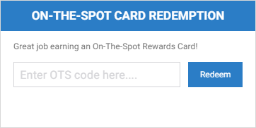
Displays an interface to your users where they can enter a claim code to redeem an On The Spot Card. When a user claims a card, an action is logged to Nitro and the award amount is applied to the user's Global Rewards Marketplace account for immediate use.
|
|
|
(click the image to show a redemption example) |
Configure a Web Component
- Open Nitro Studio > Integrate > Web Components.
- Click New > OTS.
- Enter the web component settings.
Parameters are used when working directly with a web component embed tag (HTML) or editing the config.json file for Bunchball Go. - web component - set the component tag as bunchball-ots.
- iframe - must match exactly with the name of the web component created in Nitro Studio.
- web component - Recommended. Web components improve performance due to faster loading. Height and width settings are not required as the web component will fill space on the page like any other HTML element.
- iframe - The source code is a div tag and the rendered web component will be inside an iframe.
|
Studio Field |
Description |
Parameters |
||||
|---|---|---|---|---|---|---|
|
Web Component Embed HTML |
Bunchball Go config.json |
Valid Values |
Required (web component) |
Required (iframe) |
||
|
Name |
The web component name. |
name |
name |
|
No |
Yes |
|
Width |
The web component's width. |
width |
width |
|
No |
Yes |
|
Height |
The web component's height. |
height |
height |
|
No |
Yes |
|
Custom Styles |
The link to your custom stylesheet(s). Accepts a comma delimited list of URLs. |
|
|
|
|
|
|
Embed Type |
Specifies the type of embed code to generate. |
data-embed-type |
embed-type |
iframe |
No |
Yes |
|
User ID |
The ID of the user to apply the award to. |
data-user-id |
user-id |
|
Yes |
Yes |
|
Title |
The title to display in the web component's header. Default is On The Spot Card Redemption. |
data-title |
title |
|
No |
No |
|
Subtitle |
The subtitle to display below the web component header. |
data-subtitle |
subtitle |
|
No |
No |
|
Welcome Message |
The text to display above the redemption field. |
data-welcome-message |
welcome-message |
|
No |
No |
|
Language |
Add a language code to preview the web component in a Nitro supported default language. Default languages are: en, de, hi, zh, it, es, and fr. |
|
|
|
No |
No |
|
Custom Language Reference |
Add a language code and then add a custom translation key to the browser console to preview the web component in a non-default language. |
|
|
|
No |
No |
- Click Save & Finish and reopen the web component.
- Click Get Web Component Embed Code. Copy the code to the clipboard or a file.
- Include the code to generate an OAuth token in your app.
- Insert the embed code into the page/div where you want to display the web component in your app or web page, and update the variable for the OAuth token.
Sample Embed Code
See Embed an OAuth Web Component for more information and the Web Components view for the most up-to-date embed code. The following is an example embed for an OTS web component.
|
web component |
iframe |
|---|---|
|
Copy
|
Copy
|
See also