Bunchball Go Stylesheet
Note: See Impact+ for our new standalone performance and engagement solution.
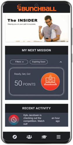
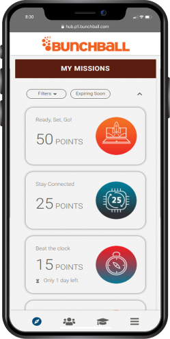
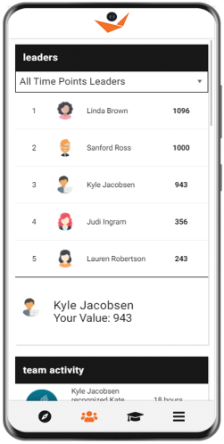
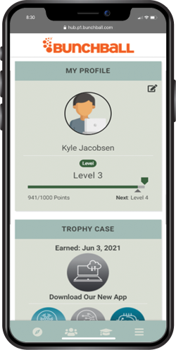
Bunchball Go programs can use a custom stylesheet to give you control over your program's look and feel. Elements such as backgrounds, text, section headers, buttons, and the navigation bar can be customized. The stylesheet is hosted by Bunchball and can be changed upon request.
Configuration of the logo, banner image, and section titles are managed in Nitro Studio Integrate > Go. See Bunchball Go Configuration
Customization Examples
|
|
|
|
|
Styles and Layout
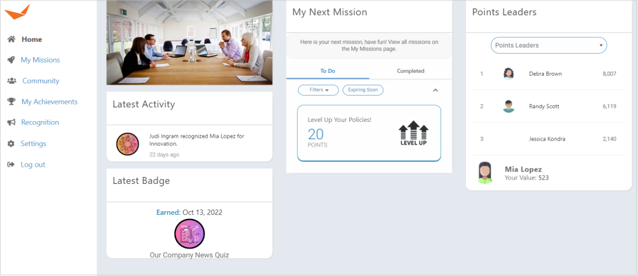
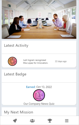
Bunchball Go can be configured for desktop and mobile displays. If your program runs on larger screens, pages can be configured to load in multiple columns. This desktop layout is responsive and will display in one column on smaller screens and mobile devices. You can also use a mobile only layout where elements always display in one column on both desktop and mobile devices.
|
|
|
|
Desktop Layout |
Mobile Layout |
Typically, Bunchball Go programs incorporate custom styling to match brand guidelines. The most common styling changes include setting a custom color for the background, navigation bar, navigation bar icons, buttons, and text. See Styling Web Components and Styling Blocks for detailed CSS style overrides.
See also
