Styling Blocks
Blocks can be easily styled using a theme. Together with our imagery and character recommendations, a theme helps you create a personalized user experience. Our base theme is built with CSS variables, which you can modify to align with your brand guidelines. Variables ensure reusability, consistency, and simplified maintenance within the theme.
 Nitro supports updating the variables in the base stylesheet to align with brand standards. However, making additional changes beyond the standard variables could affect ADA compliance and cause issues as new features are released. Any customizations outside the standard stylesheet variables are done at your own risk and will not be supported.
Create a Theme
When you activate a theme in the theme builder, all embedded blocks will automatically update their styles to match that theme. If you do not have an active theme, blocks will use the default out-of-the-box styles.
-
Open Nitro Studio > Integrate > Themes.
-
Click New, or click an existing theme to edit.
-
Click Edit (
 ) and enter a theme name.
 -
Upload or link to your custom CSS file. If a stylesheet is stored in an external location, Nitro must have access to that location. Show me the supported characters for a CSS file name

-
Use the Activate Theme toggle to set the theme as the active theme for all blocks.
Only one theme can be set as the active theme. If you delete or deactivate the active theme, all blocks will revert to the default styles.
-
Use the Preview list to view the theme in Impact, Recognitions, or Impact+.
-
Click Save.
Note: If you're testing a theme by uploading the same stylesheet multiple times and your changes aren't reflected in the theme preview, try changing the name of the CSS file and uploading again.
Stylesheet Best Practices
-
Only add necessary overrides to the stylesheet. Remove elements you're not changing to keep the stylesheet easier to read and process.
-
Maintain ADA compliance. Impact meets WCAG 2.0 standards in its default configuration. If you make changes and are concerned with maintaining ADA compliance, run a contrast checker tool once your changes are in place.
-
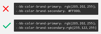
Keep the color format consistent. Nitro supports RGB, HSL, and HEX values. We recommend using the same format throughout. Show me
-
Use comments to separate declarations. When updating the stylesheet, comments help isolate the areas changed so anyone can review and update. Show me
-
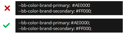
Ensure your declarations are properly closed and you did not omit a semi-colon. Show me
-
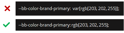
Ensure you properly replace the value with your custom override. Show me
-
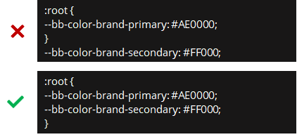
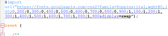
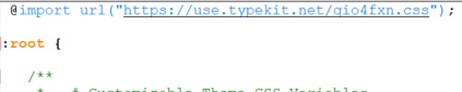
Ensure your declarations are inside the :root {}. The exception to this is the @embed code for custom fonts which is outside the root. Show me
Common Style Overrides
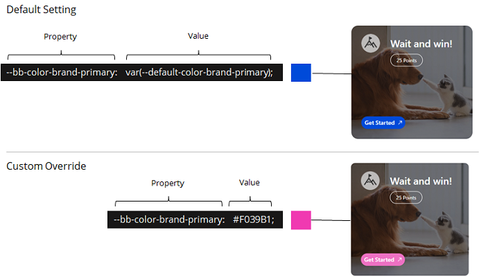
To override a variable, find the property you want to update and change the value to your custom setting. All variable overrides must be inside the root with the exception of custom fonts. Show me an example
The following are elements you may want to change to support your brand. Some colors are derived from the variable color.
Additional overrides are available if you need to create a more robust custom theme. Your account team can provide the full stylesheet.
|
Block |
Element to Change |
Property |
|---|---|---|
|
Impact
|
The color of the call-to-action buttons in mission tiles (Get Started, Continue, View, etc.) and the circles highlighting positions 1-3 in leaderboard. |
--bb-color-brand-primary: |
|
The background color of secondary buttons (quiz Confirm, award account Redeem, etc.). |
--bb-color-brand-secondary: |
|
|
The color of the award account balance background. |
--bb-award-account-balance-bg-color: |
|
|
The background color of Impact. By default, this is light gray. |
--bb-color-brand-background: |
|
|
The color of the progress bar in the At a Glance section. |
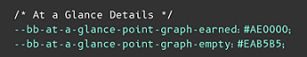
--bb-at-a-glance-point-graph-earned: |
|
|
The font. |
--bb-font-family: |
|
|
The radius of badges and user icons. 0 = circular and 1= square. |
|
|
|
The outer padding between the block's edges and the elements within it. Note: We highly recommend adding padding on the page around the block rather than within the block itself. If you must add padding, ensure you only add left/right padding or the block's fixed height will not work as designed. For example, set padding as --bb-impact-padding-compact-view: 0 25px; |
|
|
|
The mission tile overlay on tiles that are using a custom background image. 0 = Dark overlay with light text (default setting) and 1 = Light overlay with dark text. Click to see overlay examples.
|
--bb-mission-overlay-light-mode: |
|
|
The color, style, width, and radius of the Impact block's border. |
|
|
|
Recognitions |
The color of the active tab and "Send a recognition" button. |
--bb-recognitions-button-bg-color: |
|
The color, style, width, and radius of the Recognitions block's border. |
|
|
|
Impact+ |
The color of the header background and text. |
|
|
The height of the header. |
--bb-impact-plus-header-height: |
|
|
The color of the Recognitions button background and text. |
|
|
|
The color of the footer background and text. |
|
|
|
The height of the footer. |
--bb-impact-plus-footer-height: |

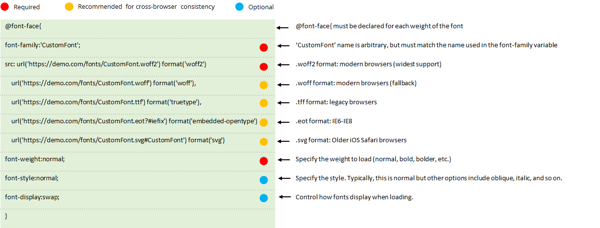
Custom Fonts
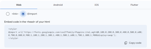
Blocks support default fonts, Adobe and Google fonts, and custom fonts that are externally hosted in a location Nitro can access. Code is added to the theme's stylesheet to render the selected font.
Show me how to use a default font
Show me how to use a Google font
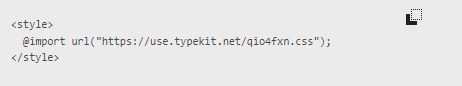
Show me how to use an Adobe font
Show me how to use a custom font
Example Themes
The following examples change the font, the buttons in Impact and recognitions from blue to red, and the mission tile gradient to grays.
Show me an example using a Google font
Show me an example using a custom font with one weight
Show me an example using a custom font with multiple weights
See also